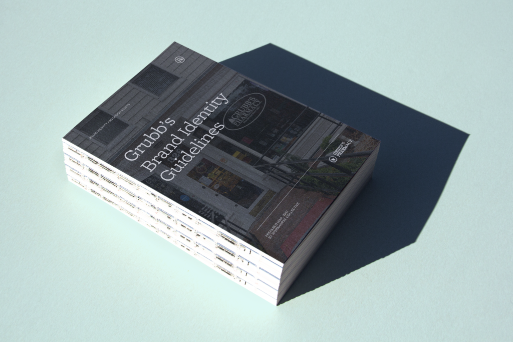
Grubb's Pharmacy
Grubb's Pharmacy
Revitalizing the Grubb's Pharmacy brand.
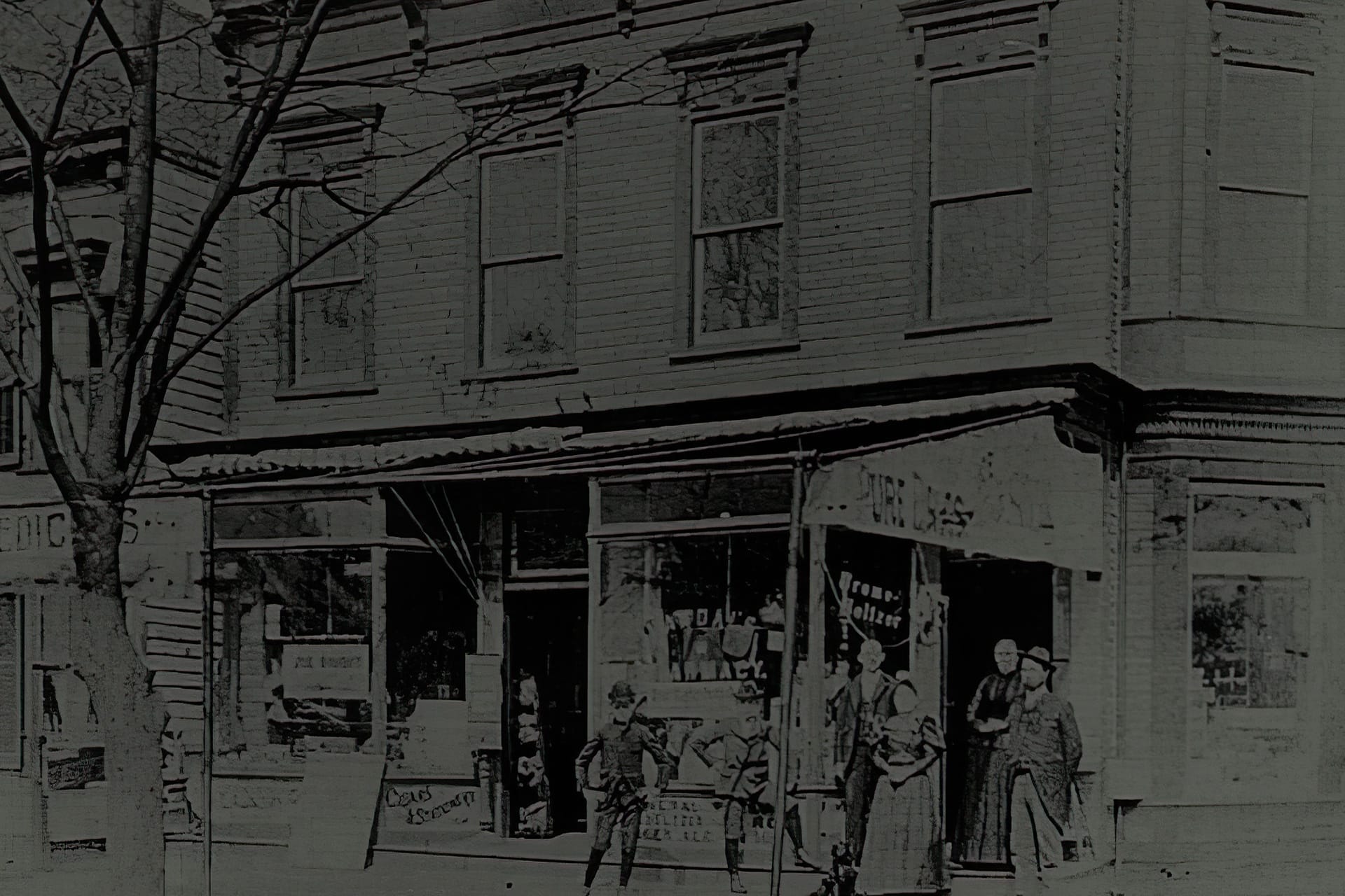
When it comes to a neighborhood-focused family-owned compounding pharmacy, there weren't a lot of comparisons. Because faceless big-box chains have replaced most independents, we had to carve a unique path.
Design System
A pharmacy brand at home in its own century.
Recoleta on Pharmacy Green, Sofia Pro for the everyday — a system that reads like a place that knows your name.
Color Palette
Pharmacy Green
PrimaryMortar Cream
BackgroundRx Red
AccentInk
NeutralApothecary Gold
SecondaryContrast Pairings
How the palette colors perform together — text on surface combinations ranked by contrast ratio.
Aa
Mortar Cream
Aa
Ink
Aa
Pharmacy Green
Aa
Mortar Cream
Aa
Ink
Aa
Apothecary Gold
Aa
Mortar Cream
Aa
Rx Red
Aa
Rx Red
Aa
Ink
Aa
Pharmacy Green
Aa
Apothecary Gold
Type System
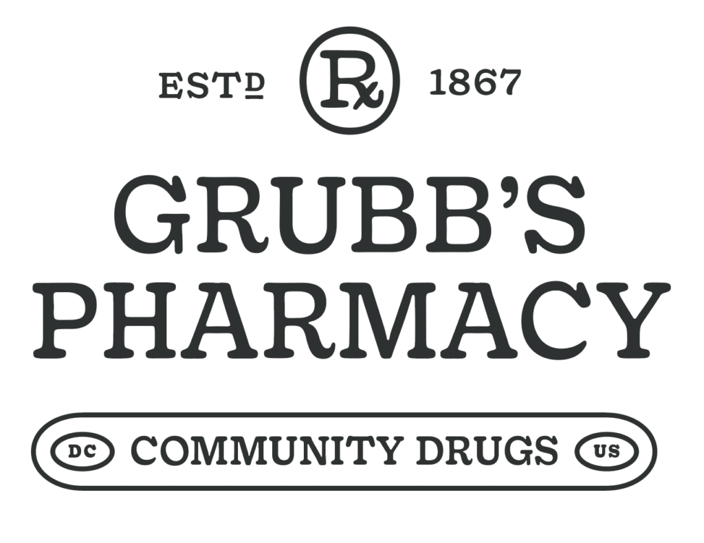
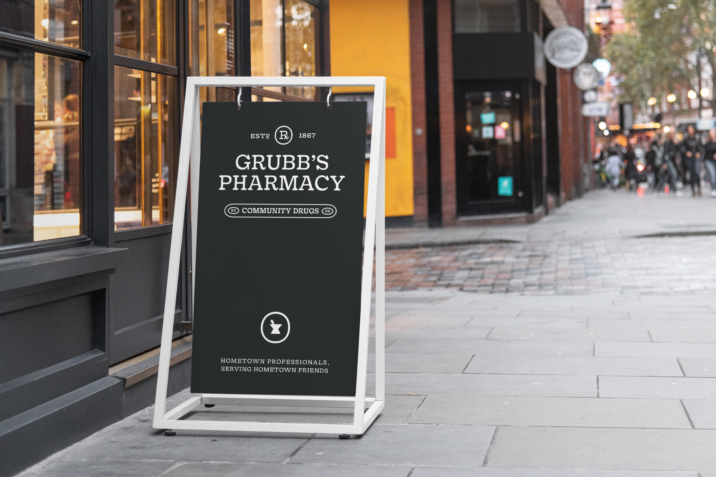
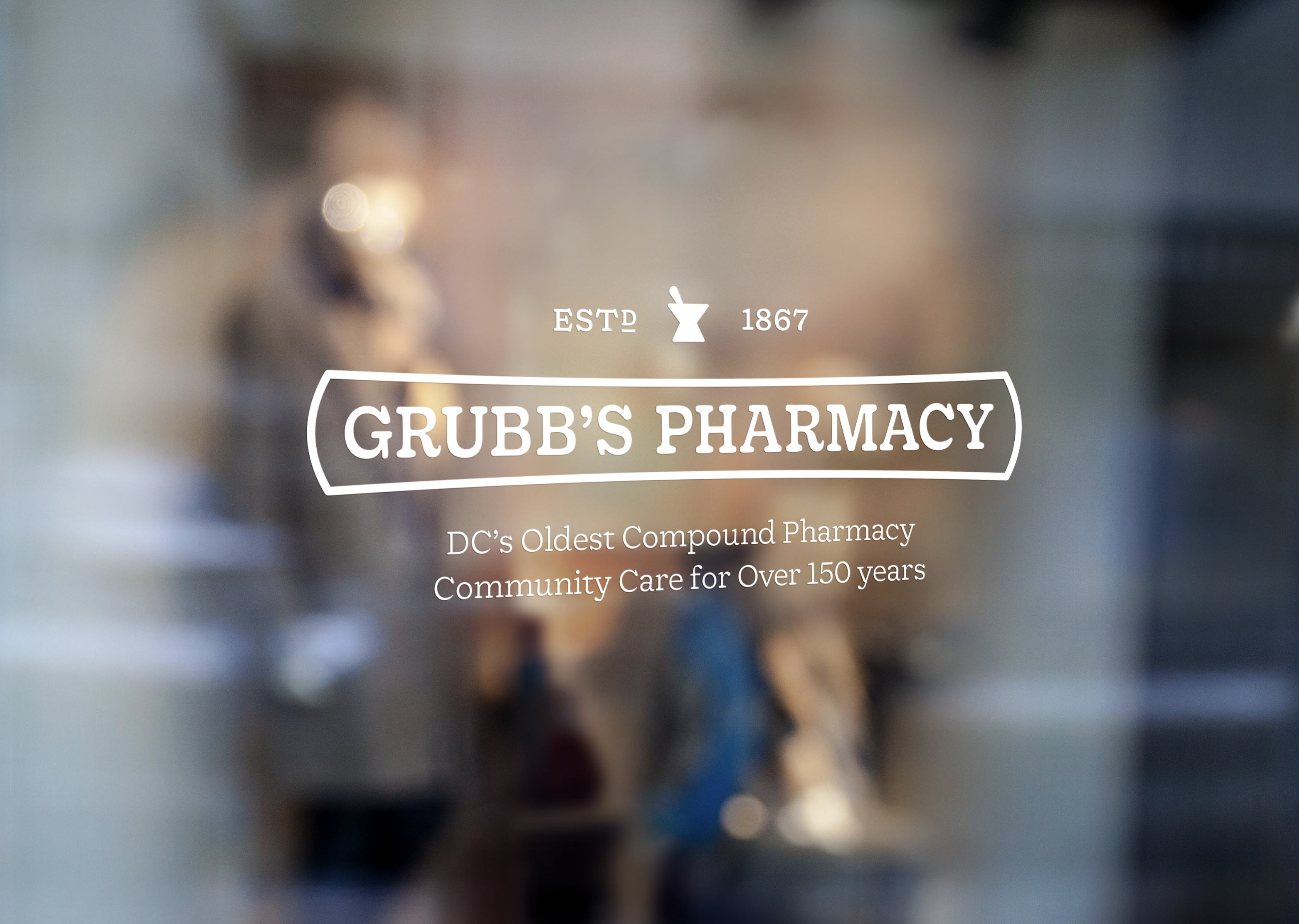
Grubb's has been part of Capitol Hill since 1867
Grubb's has been part of Capitol Hill since 1867. We compound prescriptions, sto...
Grubb's has been part of Capitol Hill since 1867. We compound prescriptions, stock the essentials, and still remember what your grandmother used to order.
Recoleta Alt · 0123456789 · 700
Recoleta
Signage, headlines, and brand lockups
Sofia Pro
Labels, guidelines copy, and digital
Recoleta Alt
Monograms and decorative initials
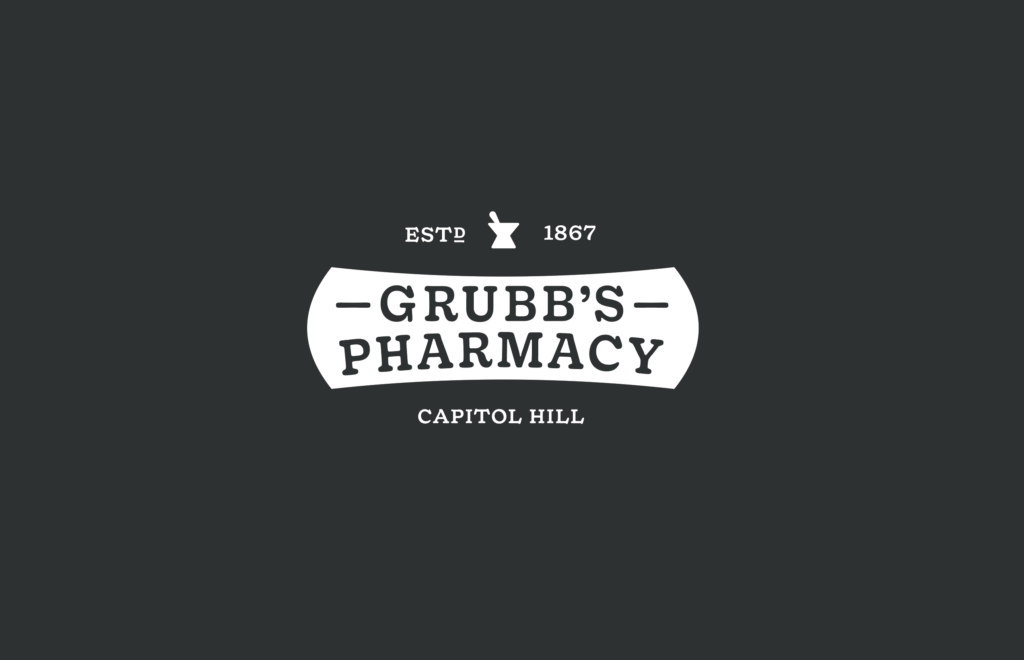
Marks & Lockups
A system that grew with the festival.
What started as a wordmark in 2015 grew into a complete mark library — lockups, compact icons, laurels, anniversary seals, sub-brand treatments, and social assets. Each addition answered a real need as the festival expanded.
01Primary Lockup
 02
02Secondary Mark
 03
03Signage Application
Voice
How the brand sounds out loud — the tone every word inherits.
We're the pharmacy that knows your name. Write like it.
Celebrate 100+ years without sounding like a museum.
Health is personal. So is our tone.
Shaping the Future, One Visionary Brand at a Time
Workhorse Brands: Built for the Long Run.
For over a decade, we’ve empowered ambitious individuals to build ambitious brands through strategic storytelling, precise aesthetics, and robust systems.
Powerful, authentic, and immersive brands for science, art, and culture since 2014.
For over a decade, we’ve empowered ambitious individuals to build ambitious brands through strategic storytelling, precise aesthetics, and robust systems.
“Brand Sprints” might just be a fancy term, but if it means we deliver fast, impactful results on time, then we’re ready to run.
Schedule a Call